Improving the debt collection process for customers
I’ve been engaged to provide experience design services twice on this portfolio, for the Commonwealth Bank. Once in 2015 and again in 2017.
This work provided a number of insights, most significant were the benefits driven from simple changes to content along with making the payment process easier.
About this project
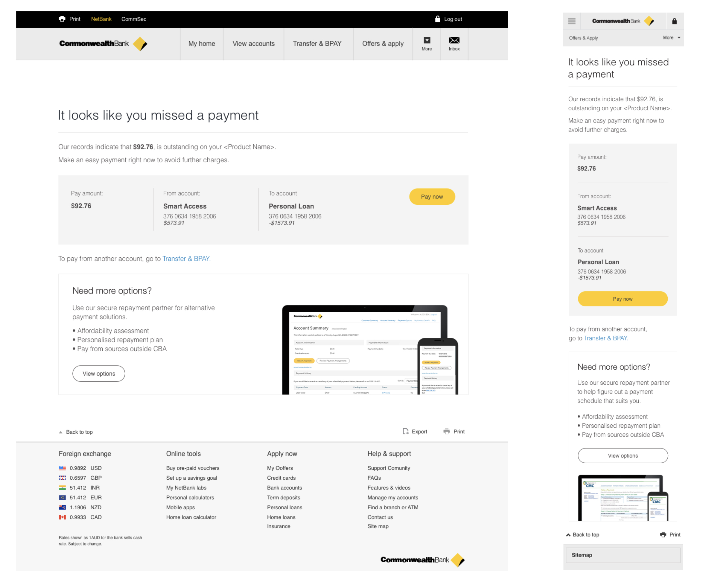
The 2015 Collections work saw a significant uplift in payments made via a new pre-delinquency strategy where customers were proactively contacted with reminders to make payments and avoid arrears. My role on this project was to develop a new suite of messaging covering the entire Collections cycle, a one click payment page with a payment plan option. I was a hybrid on this project and was responsible for UX and content design.
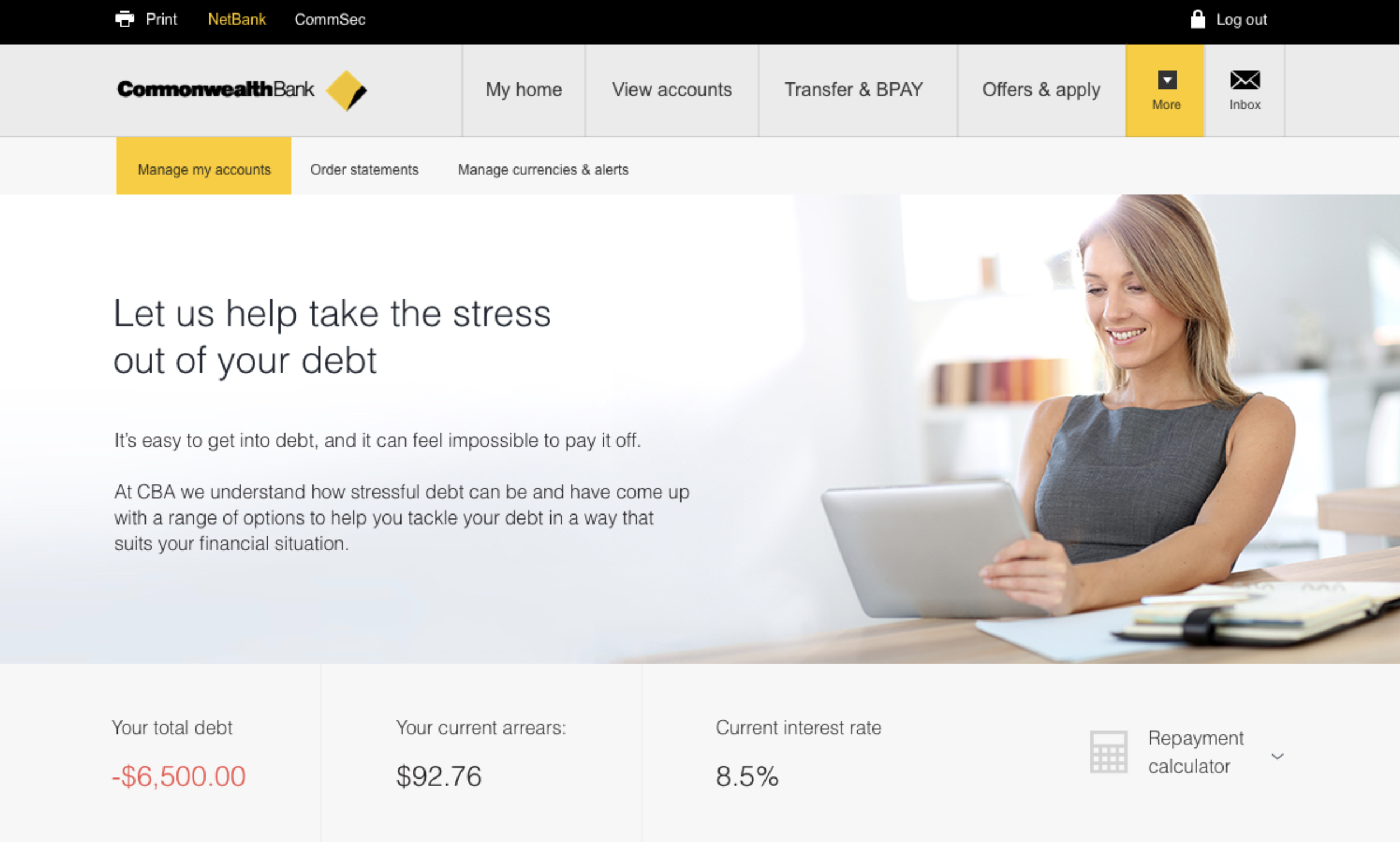
The 2017 Collections work was heavily focused on how we could better meet the needs of our customers experiencing financial hardship. My role on this project was from inception to delivery. I explored the customer journey from account inception to closure as they move through different stages of financial hardship. After defining the problems, we were trying to solve, I designed and delivered features which are currently still live in market across NetBank and the CommBank app.
What we did
2015- A pre-delinquency strategy where customers were proactively contacted with reminders to make payments and avoid arrears.
I prototyped, tested and built the features- to understand the behaviours of customers in arrears, optimal language/ conversations to be having, digital adoption and how to reduce debt/ ease the burden for customers who have missed payments.
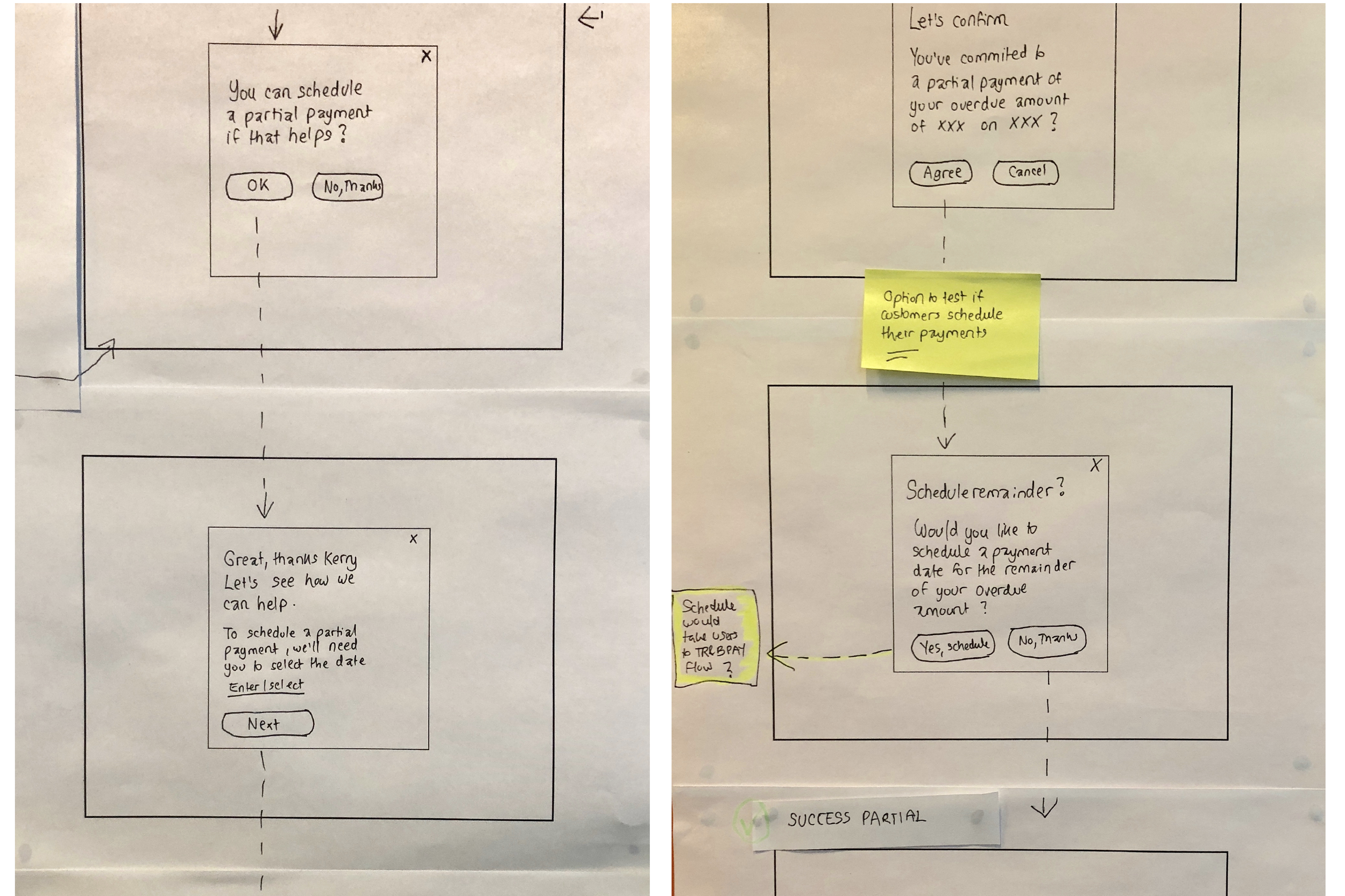
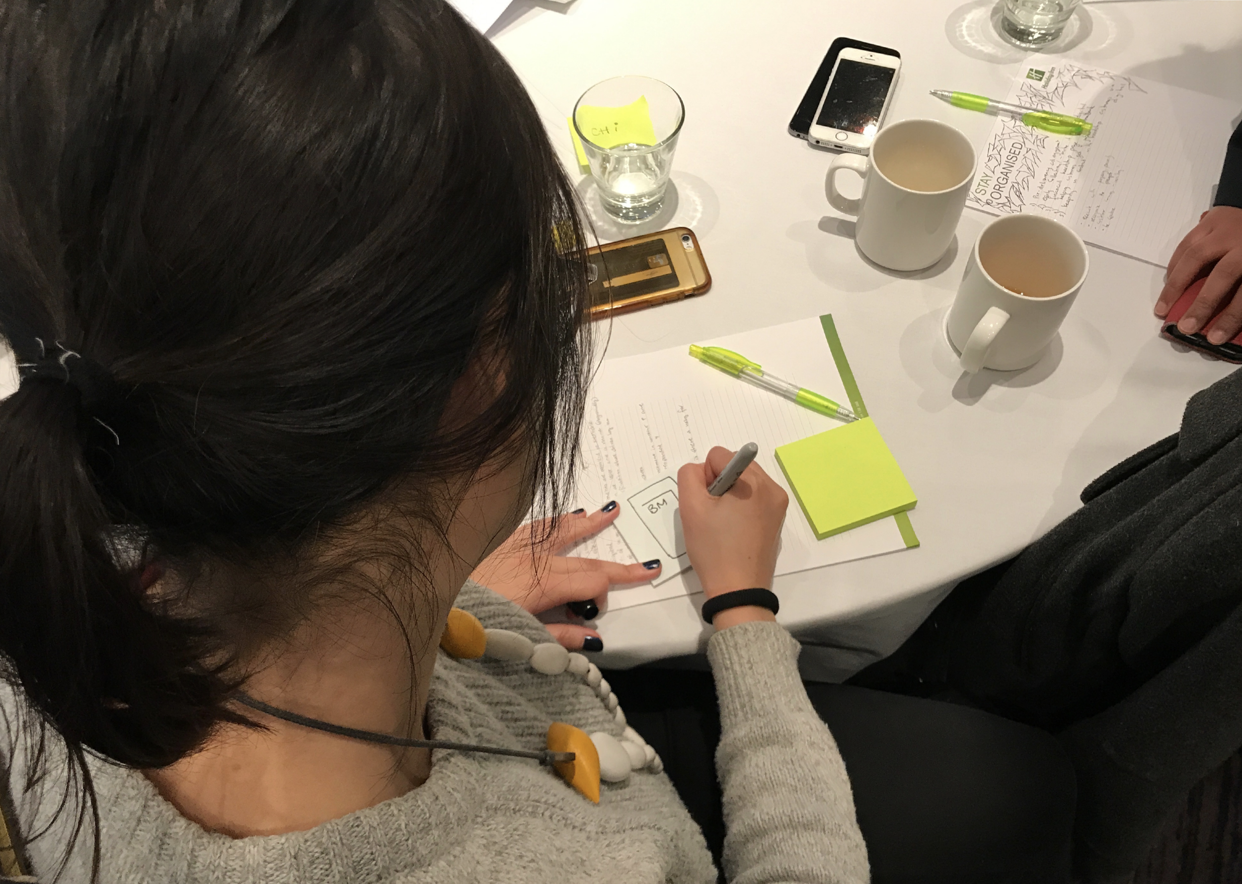
2017- Over 5 weeks we ran a series of co-design sessions, combined with a rapid cadence of prototyping and testing.
These gave us invaluable insight into customer concerns around debt, control of their situation, problems with current process, and institutional trust…
Through testing we uncovered an opportunity to give customers who have missed a payment more control over their situation, allowing people to promptly pay online without receiving phone calls and letters.
My key outputs
User testing & customer research
Rapid prototyping
Product design
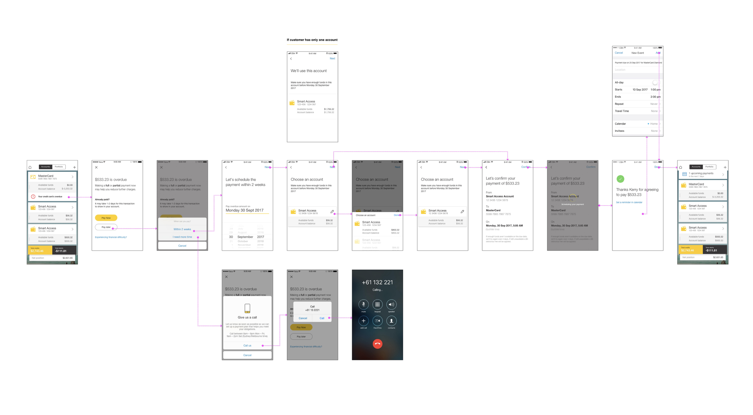
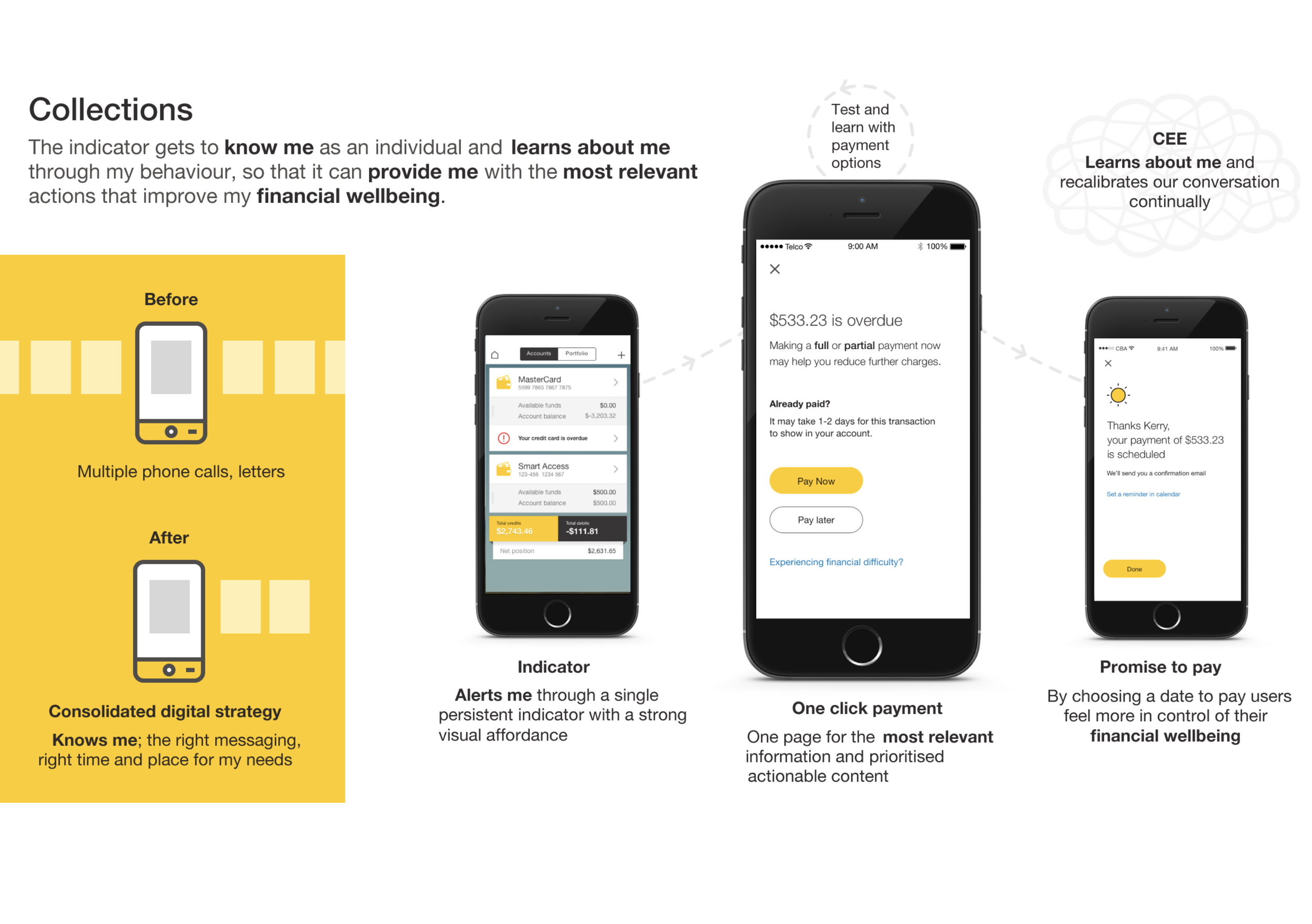
Built awareness through always on indicator
Built awareness through different types of messaging
Facilitated easy payments
Enabled 2-way dialogue – click to call
Designed a feature to "Stay on track"- Promise to Pay
What we achieved
Great performance at only 4% 10 days in
3,400 customers viewed, with 27% click through
242 payments made
53 click throughs driven to the newly refreshed Financial assistance page
